Tinka / Fintech
From Repayment
Tool to Everyday
Finance
Redesigning the app, launching Pay In-Store, and building the product foundations for Tinka's next phase of growth.
Redesigning Tinka for in-store payments and everyday use
Tinka's app originally behaved like a repayment utility; functional, but purpose-built for a single moment: paying off an online purchase after the fact. The opportunity was to redesign it into something customers would return to, and to launch Pay In-Store as an entirely new use case that extended Tinka into physical retail.
This is one case study with two connected chapters. The first was a brand refresh and app redesign that made Tinka feel more modern, trustworthy, and worth opening. The second was the launch of Pay In-Store and the Tinka Card; a 0→1 product experience that gave customers a reason to use Tinka in the moments they were already spending.
The challenge
The brief had three connected problems. First: deliver a rebrand and redesign that made the app feel modern, coherent, and worth returning to; without disrupting an existing customer base. Second: design a new in-store payment journey that worked in real checkout moments, where the tolerance for confusion or friction is near zero. Third: align product, onboarding, marketing, support, and operational touchpoints across both chapters; all within the constraints of legal and compliance review on a financial product.
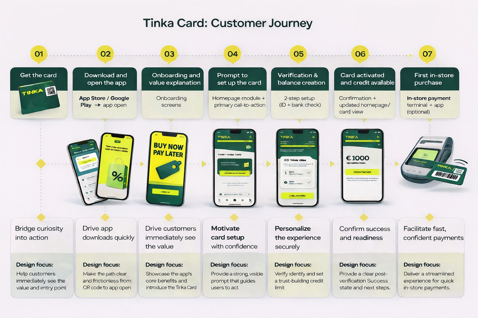
Pay In-Store wasn't just a new screen in the app. It was a new behaviour; a habit customers had never formed before with Tinka; and the product had to teach that habit clearly enough that the first real use felt obvious, not risky.
What I was responsible for
Product foundation
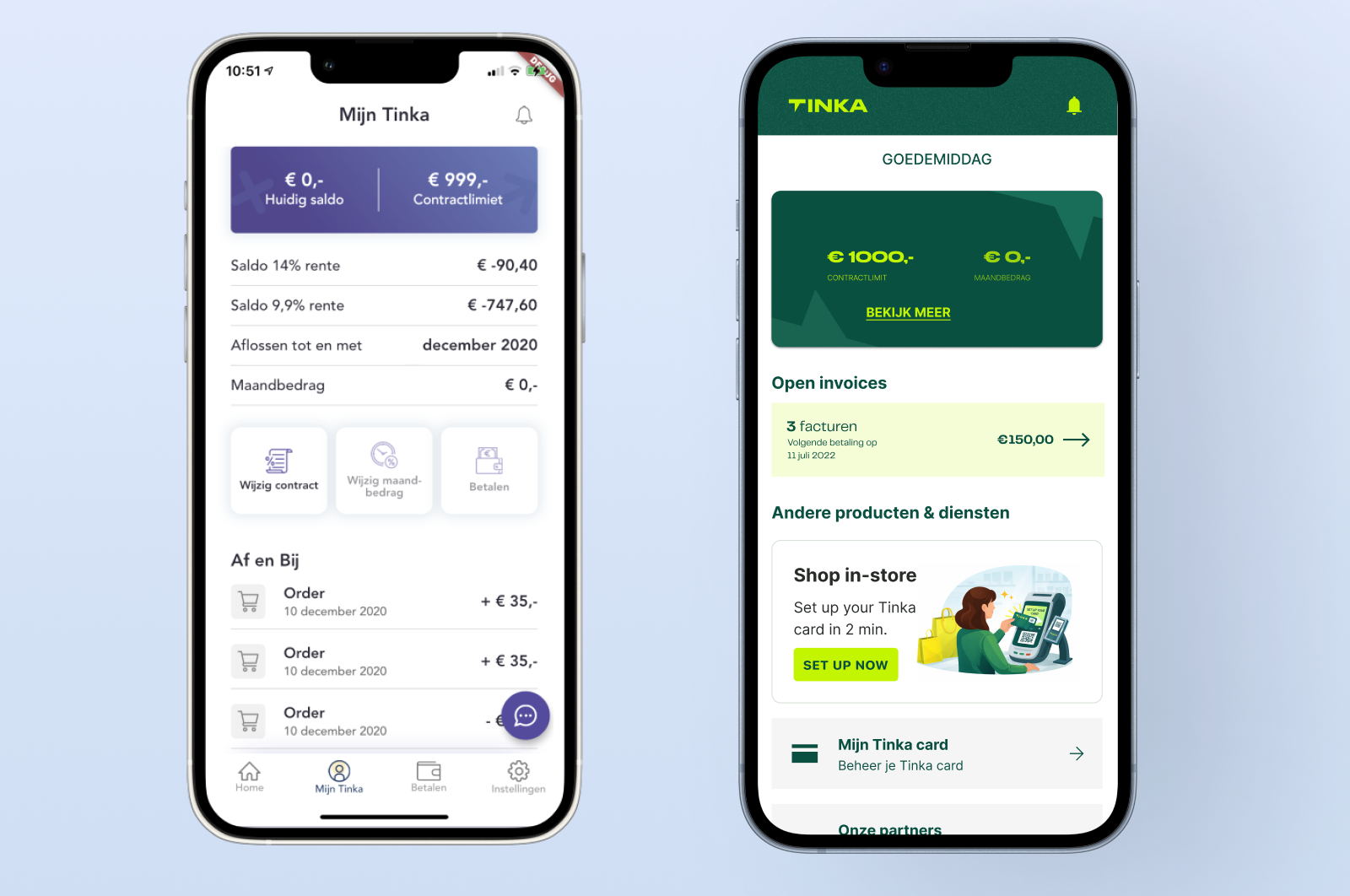
Led the redesign of the Tinka mobile app following the brand refresh; translating the new visual identity into a scalable product UI and a stronger, more returnable core experience.
Tinka Card experience
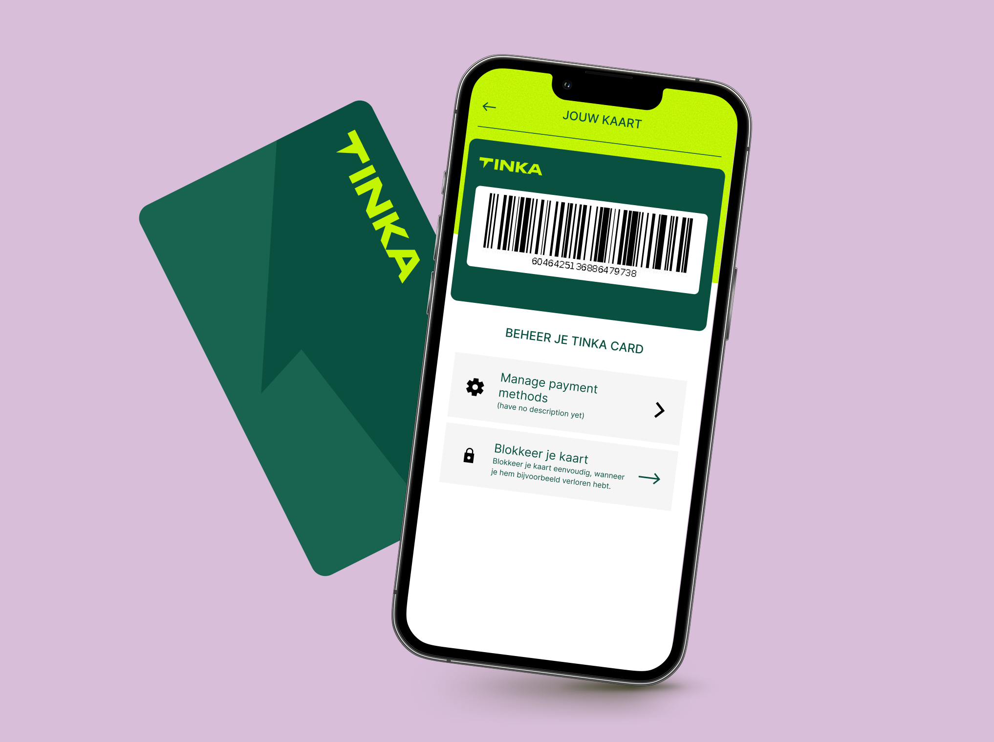
Designed the end-to-end experience for activating and using the Tinka Card in-store; from discovery and onboarding through to payment and ongoing account management.
Omni-channel experience
Worked across product, marketing, and customer care to design the supporting ecosystem; FAQs, onboarding content, campaign touchpoints, and in-store support materials.
Team & systems leadership
Helped scale the design function and put stronger foundations in place for future work; including clearer product design direction and specialist design systems support.
Launching Pay In-Store as a real customer journey
The challenge wasn't designing a card screen. It was making Pay In-Store feel credible as an end-to-end experience; one that customers could discover, activate, trust, and use with confidence in a real retail moment, often for the first time.
Approach
The work was sequenced in two chapters that depended on each other. The rebrand and app redesign came first; getting the product foundation right so that Pay In-Store launched into something coherent. The launch work then extended outward from the app into every touchpoint a customer might encounter along the way.
Turning the refreshed brand into a stronger in-product experience. The rebrand was the starting point, not the destination. The design work translated a new visual identity into a product UI that felt more considered, more trustworthy, and easier to navigate; a foundation the app had lacked.
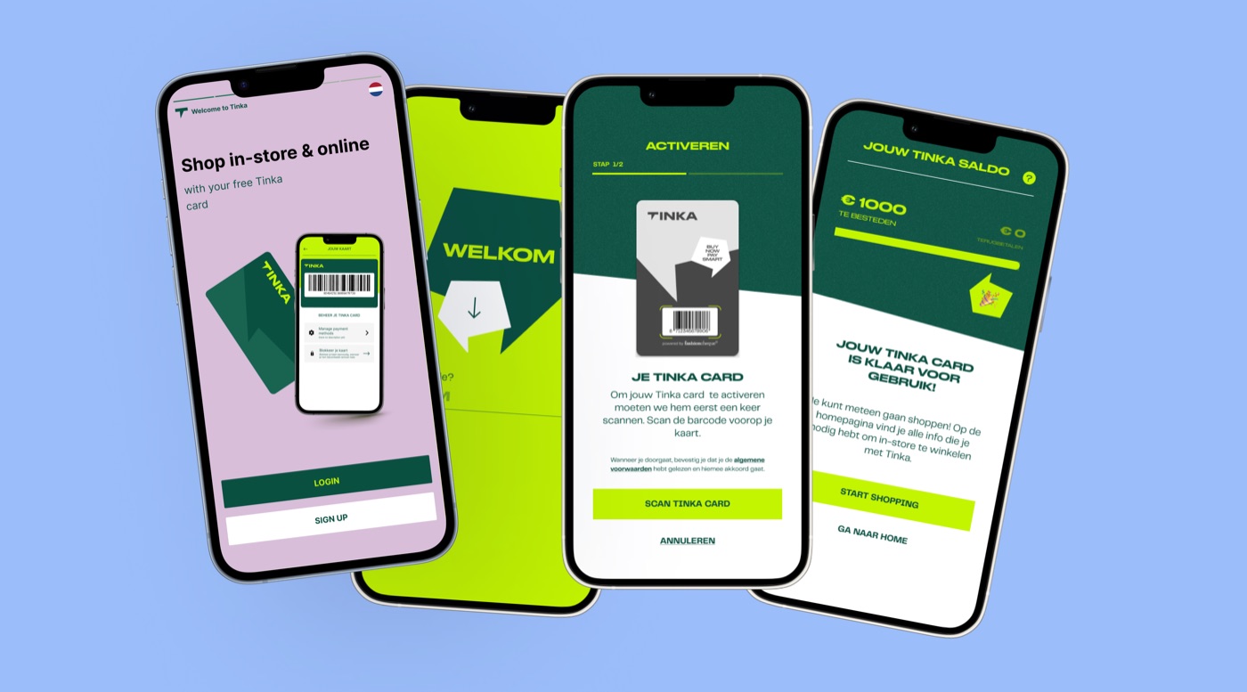
Guiding activation with clarity and trust. The Tinka Card journey was designed to remove every point of uncertainty between a customer deciding to try Pay In-Store and feeling confident enough to use it at a real checkout; verification flows, readiness states, and in-app education all designed to keep momentum rather than stall it.
Extending the work beyond the app. Pay In-Store only worked if the whole surrounding experience held together; which meant designing FAQs, landing pages, email flows, and in-store materials that aligned with the app journey and answered the questions customers would have before they ever opened the app.
Working cross-functionally throughout. The project required close collaboration with engineering on feasibility and build sequencing, with legal and compliance on the verification and credit flows, with marketing on the campaign and launch materials, and with customer care on the support content that would handle post-launch questions.
Key design question
How do you make a customer feel confident enough to use a new payment method for the first time, in a public checkout queue, with a stranger watching? That framing shaped the activation journey; every step was designed to reduce uncertainty before the customer reached the moment of truth, not to explain things after something went wrong.
What we built
Rebranded app foundation
A redesigned mobile app that translated Tinka's new visual identity into a coherent product UI; more modern, more navigable, and a stronger base for the product features that followed.
Pay In-Store journey
The end-to-end activation and payment experience for the Tinka Card; from discovery through verification, readiness, and first use; designed to guide a new behaviour with clarity at every step.
Omni-channel support layer
The surrounding ecosystem that made the launch credible beyond the app; landing pages, email flows, FAQs, and in-store materials aligned to the product journey and built to handle customer questions at launch.
Build-ready design direction
Stronger product design foundations; clearer direction, component patterns, and documentation; that gave the team more confidence to move faster on subsequent features without returning to first principles.
Why this project matters
The redesign and Pay In-Store launch helped shift Tinka from a repayment utility into a more active financial touchpoint; giving customers stronger reasons to return to the app and engage beyond paying something off. 200 cards were activated in the first 5 days, app engagement increased by 10%, and downloads rose 15%.
The launch validated the core hypothesis: that a more considered product experience, paired with a genuinely new use case, could change how customers related to Tinka; not just as a debt management tool, but as a payment product they chose to use.
200
Tinka Cards activated in the first 5 days after launch.
+10%
Increase in app engagement following the redesign and Pay In-Store launch.
+15%
Increase in app downloads in the period following launch.
What this says about how I work
I design beyond the interface
Launching a payment experience required designing not just the product, but the surrounding ecosystem; marketing, support, and retail touchpoints that had to hold together for the launch to feel credible. The app was the centrepiece, not the whole job.
Trust is critical in fintech; especially for new behaviour
New payment behaviour only works when the product communicates clearly at every step, especially around activation, verification, and readiness. Customers won't try something new if the design leaves them uncertain about whether it's working.
Foundations enable growth
Rebrands become more valuable when they are used as an opportunity to strengthen the product foundations underneath them. The redesign didn't just change how Tinka looked; it made the next phase of the product possible.
Cross-Channel Enrolment Personalisation
Connecting email, onsite experience, and enrolment flow through a cross-channel personalisation system that attributed measurable revenue across the campaign period.