Western Sydney University
Cross-Channel
Enrolment
Personalisation
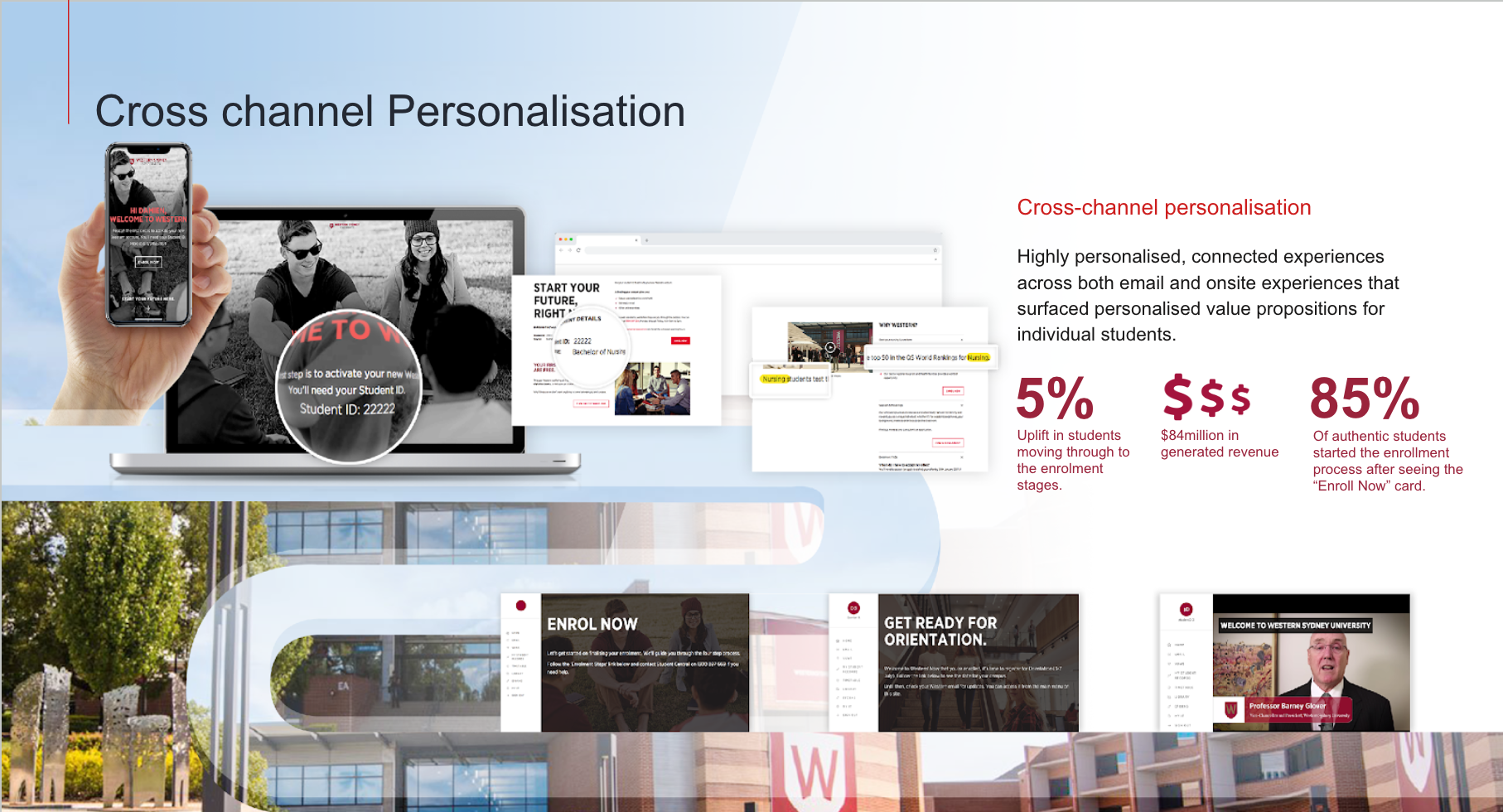
Connecting email, onsite experience, and enrolment flow through a cross-channel personalisation system that attributed ~ $84M over the campaign period, including ~ $21M in a single 48-hour window.
Personalisation that makes the right message land at the right moment
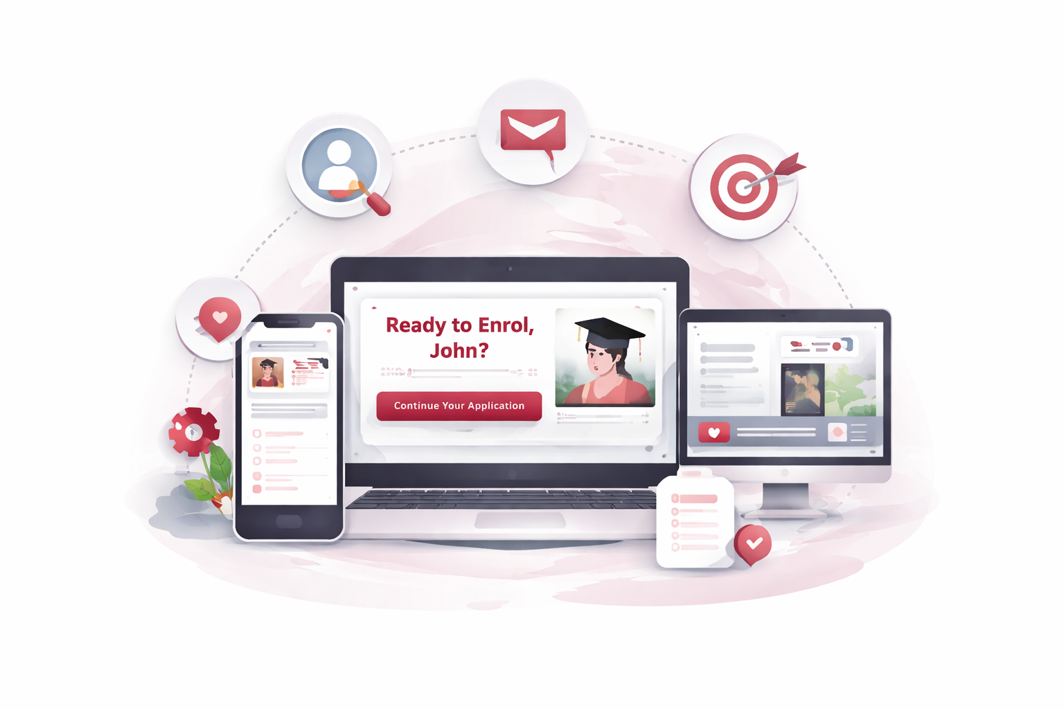
Most university marketing works hard to generate interest, but often loses momentum at the exact point where a prospective student is ready to act. Email campaigns create intent, then landing pages reset the experience with generic content, weak continuity, and too much friction between curiosity and enrolment.
This project closed that gap by designing a cross-channel personalisation system that connected email source, programme interest, and onsite experience. Instead of treating each click as a fresh start, we used those signals to create more relevant journeys from email through to enrolment. The result was a system that attributed ~ $84M over the wider campaign period, including ~ $21M in a single 48-hour campaign window.
The challenge
The existing approach treated every prospective student identically, regardless of which programme they were interested in, which cohort they belonged to, or how far along their consideration journey they were. Email open rates were reasonable. Click-to-enrolment conversion was not.
The gap wasn't awareness. It was the experience between the email and the form: the moment where interest could have been captured but the page didn't do enough to hold it.
What I was responsible for
Email campaign design
Template design and content architecture for segmented, personalised email campaigns across multiple programme areas. These were structured to carry intent signals through to the landing page.
Landing page design
Source-aware landing pages that responded to campaign origin and programme interest, reducing the experience gap between the email a student received and the page they arrived on.
A/B testing strategy
Designed and structured split tests on key conversion moments, from form presentation to content ordering and social proof placement, with clear hypotheses and measurement criteria.
Conversion funnel analysis
Identified drop-off points across the enrolment journey and redesigned the highest-friction moments to reduce abandonment at the stages closest to commitment.
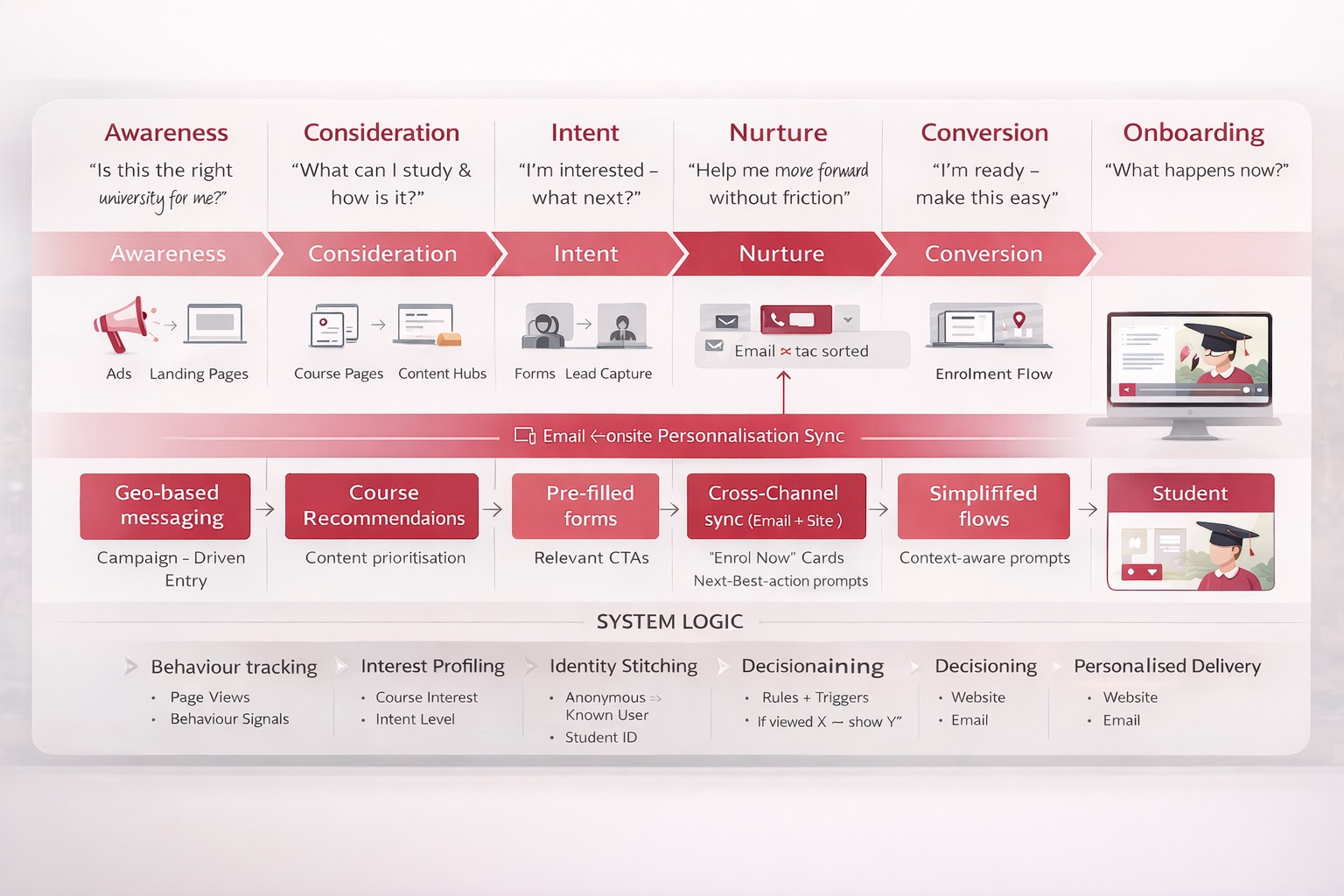
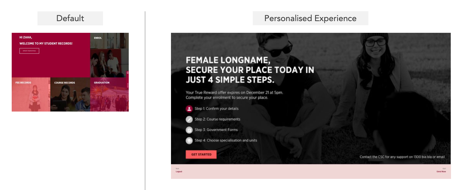
The source-aware landing page system
The most valuable shift was not a single page variation. It was the decision to treat email and onsite experience as one connected system. Once the landing page responded to source, programme interest, and lifecycle context, personalisation stopped being campaign dressing and became a meaningful conversion lever.
Approach
The personalisation system was designed around a simple premise: the experience a student has on the landing page should feel like a continuation of the email they just read, not a reset to a generic page. That required every layer of the campaign to be designed as a connected system.
Source awareness. Landing pages read campaign source parameters and adapted hero content, programme information, and CTAs to match the specific email context the student came from.
Content matching. Programme-specific proof elements (student testimonials, employment outcomes, scholarship availability) were surfaced based on declared interest rather than institutional defaults.
Social proof architecture. Trust signals were sequenced by what moved each programme's specific audience: a different ordering for career-changers than for school leavers, a different emphasis for international students than domestic.
Form optimisation. The enrolment form was restructured using progressive disclosure, clear field labelling, and mobile-first input design to reduce the perceived effort of the final commitment step.
Key design question
How do you design for a prospective student who doesn't know what they don't know. Someone who needs enough specificity to feel seen, but enough breadth to discover options they hadn't yet considered? The personalisation system had to work for students who arrived with a clear programme in mind and for those who were still deciding. Getting that balance wrong in either direction meant losing them.
What we built
Email template system
Personalised, segmented campaign templates structured to carry programme intent signals through to the onsite experience, not just deliver a message.
Source-aware landing pages
A set of landing page variants tied to campaign source, programme category, and student cohort; each tailored to the specific context the student arrived from.
A/B test framework
A structured testing programme covering headline framing, proof ordering, form presentation, and CTA copy. Each test was designed to isolate the mechanism, not just measure the outcome.
Conversion funnel analysis
A documented analysis of the enrolment funnel identifying high-drop-off moments and the specific design rationale for each intervention made.
Why this project matters
The system attributed ~ $84M over the broader campaign period, with ~ $21M generated in a single 48-hour window. It also produced a +37% uplift in signups, showing that the commercial value did not come from one isolated campaign asset, but from making the handoff between channels more relevant and more continuous.
More importantly, the work validated a repeatable model for enrolment personalisation at scale. It showed that the gap between email intent and onsite experience was one of the highest-leverage points in the funnel, and that closing it systematically could generate meaningful commercial return.
~$84M
Attributed revenue across the campaign period.
~$21M
Revenue attributed to a 48-hour campaign window.
+37%
Uplift in signups from the personalised experience.
What this says about how I work
I design the handoff between channels as carefully as the channels themselves
The seam between email and landing page is where most conversions are lost, and it's the last place most teams look. Getting that transition right is often the highest-leverage move in a campaign.
I test assumptions about what "relevant" means
Relevance isn't showing more content. It's showing the right content at the moment the decision is closest. The research told us which programme-specific signals actually moved commitment, not which ones felt right to include.
I treat conversion optimisation as a design discipline, not a numbers exercise
The goal is always to make the right action easier to take; to remove friction that was never supposed to be there. The numbers are how you know it worked, not what you optimise toward.
Mystery Deal
Concept exploration and prototyping for an opaque travel product; seven directions tested to find the right balance of intrigue, trust, and conversion.