Booking.com · 2020–2022
Design Language
Portal
Creating the standards and infrastructure that helped 100+ designers and external partners make consistent design decisions at scale, without needing to ask.
Designing the infrastructure that makes good design decisions easier
Booking.com is one of the largest travel platforms in the world, with design work distributed across dozens of product teams, markets, and external agencies. At that scale, consistency is not something you can rely on instinct to maintain. It requires infrastructure.
The Design Language portal was that infrastructure: a central, navigable resource for brand and design guidance built to make the right choice easier than the wrong one. My work spanned the portal itself, iconography decision support, tone-of-voice guidance, and applying the standards against a real product surface to validate them.
The challenge
Most design documentation fails for the same reason: it's organised around what exists, not around the decisions designers actually need to make. Guidelines live in wikis that are hard to navigate, rarely updated, and too abstract to resolve a live design question.
The result was predictable: inconsistency across surfaces, repeated alignment meetings, and external partners working without a usable reference. The problem wasn't a shortage of thinking. The thinking just wasn't accessible.
What I was responsible for
Portal design
Designed the structure and navigation of the Design Language portal, organising guidance around decision types rather than asset categories.
Brand standards
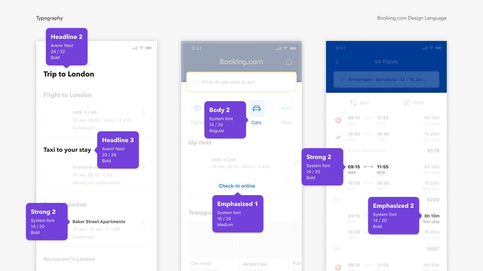
Produced brand standards documentation that translated broad principles into specific, actionable rules, usable by designers and external partners alike.
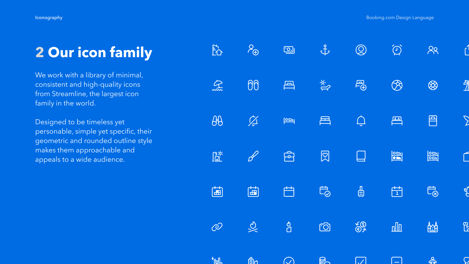
Iconography guidance
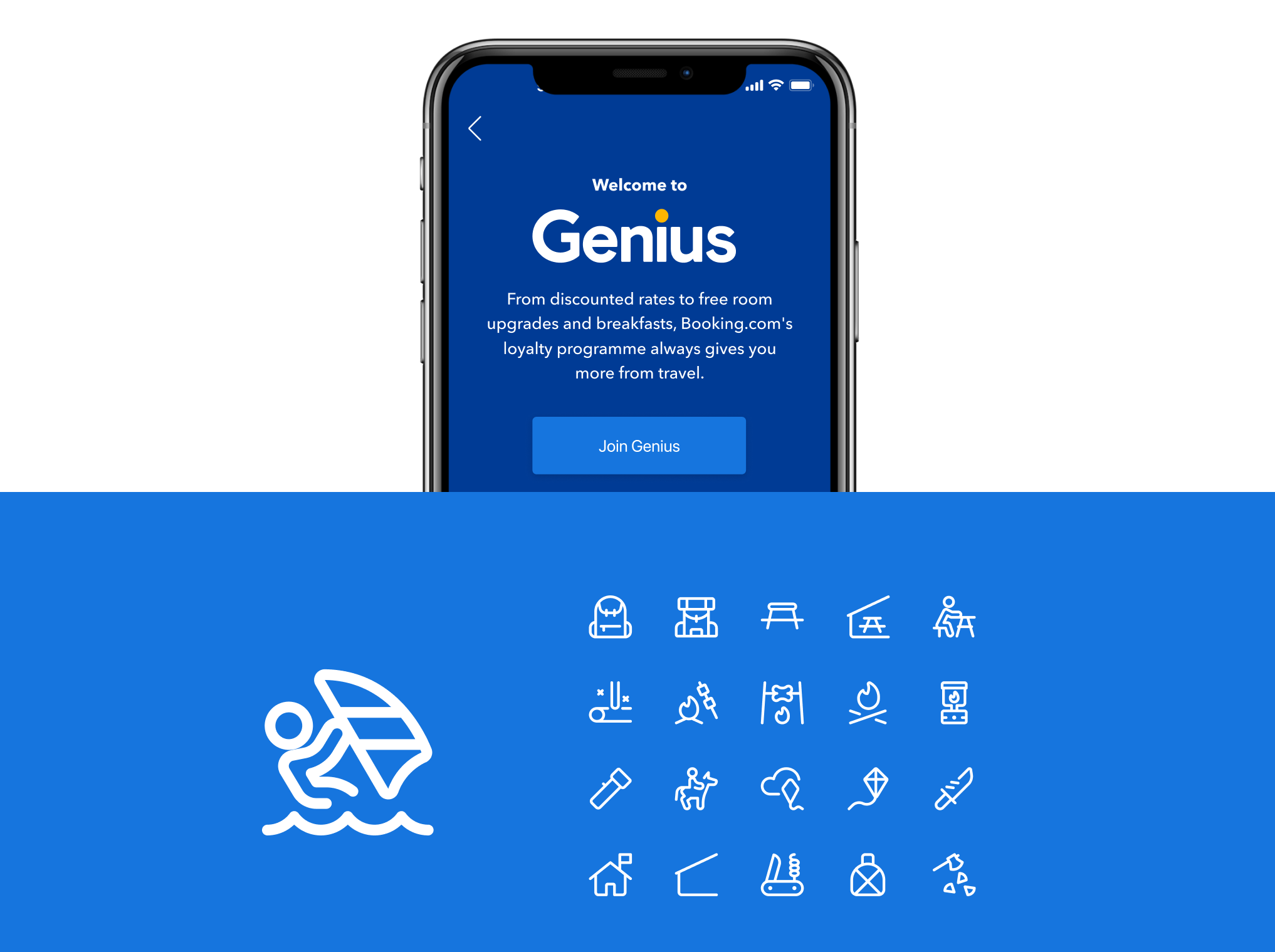
Codified iconography decision logic into a navigable decision map, helping teams choose the right icon for the right context without browsing the full library.
Tone of voice
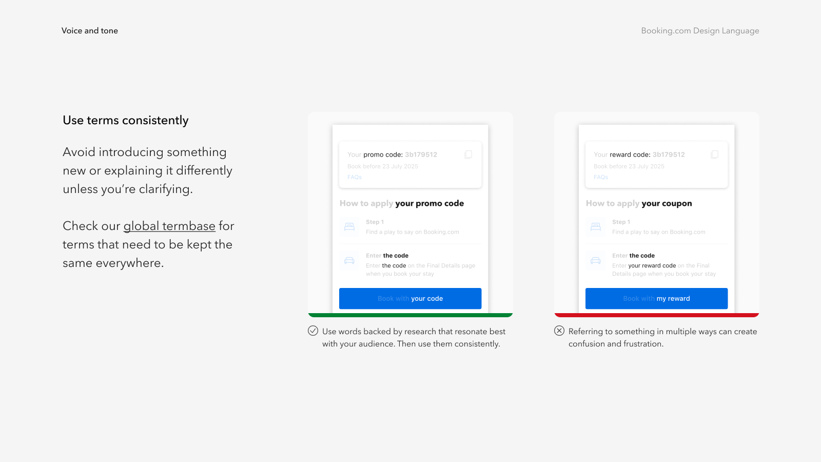
Co-created tone-of-voice patterns with UX writers, grounded in real UI examples (error messages, confirmations, empty states, notifications).
From abstract principles to decision-making tools
The most important structural decision was to organise guidance around the questions designers actually ask, not the assets that exist. That shift changed everything about how the portal was built.
Approach
Most design system work defaults to cataloguing what exists. That produces a record, not a tool. The portal was built around a different premise: organise guidance by the decisions designers face, not by the assets in the library.
Portal structure. Navigation was organised around question types rather than component categories — "which icon for a destructive action?" rather than "browse all icons."
Iconography decision map. Rather than a flat library, I built a context-based decision map that guided teams to the right icon with usage rules and real examples attached.
Tone of voice patterns. Working with UX writers, I turned high-level brand voice principles into specific writing patterns covering the moments designers most often struggled with.
Product validation. Standards were applied directly to the Flights surface before wider rollout — catching gaps that months of internal review hadn't surfaced.
Key design question
The most important question was not "what are the rules?" but "how does a designer find the right rule when they need it, under time pressure, in the middle of building something?" That reframed the work around navigation, decision flow, and example-led guidance rather than comprehensive documentation.
What we built
Design Language portal
A navigable, decision-first resource for brand and design guidance, structured around how designers think, not how assets are categorised.
Iconography decision map
Context-based icon navigation with usage rules and examples, reducing the most common source of visual inconsistency across product surfaces.
Tone of voice patterns
Do/don't patterns with real UI examples covering error messages, confirmations, empty states, notifications, and onboarding copy.
Product application examples
Standards stress-tested and applied to the Flights surface, turning principles into concrete, reusable examples grounded in real product constraints.
Why this project matters
The portal became the shared reference layer for design teams working across different product areas, reducing repeated questions and alignment meetings. External partners had a clear, navigable resource to work from without needing internal design support for every decision.
Importantly, the standards were validated against a live product surface before wider rollout, a step most design systems work skips. That meant the guidance was tested against real constraints, not just coherent in isolation.
100+
Designers and external partners using the outputs.
4
Core guidance systems created: portal, brand standards, iconography, and tone of voice.
1
Real product surface used to validate and ground the standards before wider rollout.
What this says about how I work
I design for the person under time pressure, not the person reading carefully
The portal only succeeded because it was structured around how designers actually look for things (fast, goal-oriented, under deadline) not, around how standards are typically written.
I test thinking against reality before calling it done
Applying the standards to Flights before wider release was the single most useful quality check. Abstract guidance that looks solid on paper often falls apart the moment it meets a real product decision.
I build infrastructure, not just outputs
The goal wasn't to create a comprehensive document. It was to make consistent, confident design decisions possible at scale, for people who weren't in the room when the decisions were originally made.
Enabling Personalised Experiences
Service design and experience strategy for a complex, fragmented ecosystem, defining operating models, audience-first structures, and cross-channel personalisation foundations.